
ARITZIA
Aritzia's successful blend of opposite clothing styles, along with their philosophy, “luxury items without luxury prices", inspired the idea of extending this pattern of contradictions into the branding design. By adopting the fusion of opposing design elements (edgy yet feminine, grungy yet sleek, sophisticated yet urban) into Aritizia’s branding, the boutique is in sync with their product line, in-store aesthetic, and characteristics of their target consumer.
branding, merchandise, logo design


Initial Logo Sketches
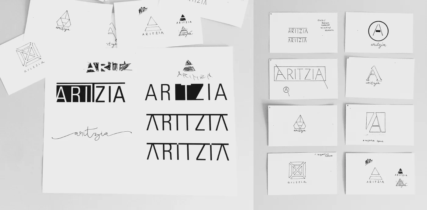
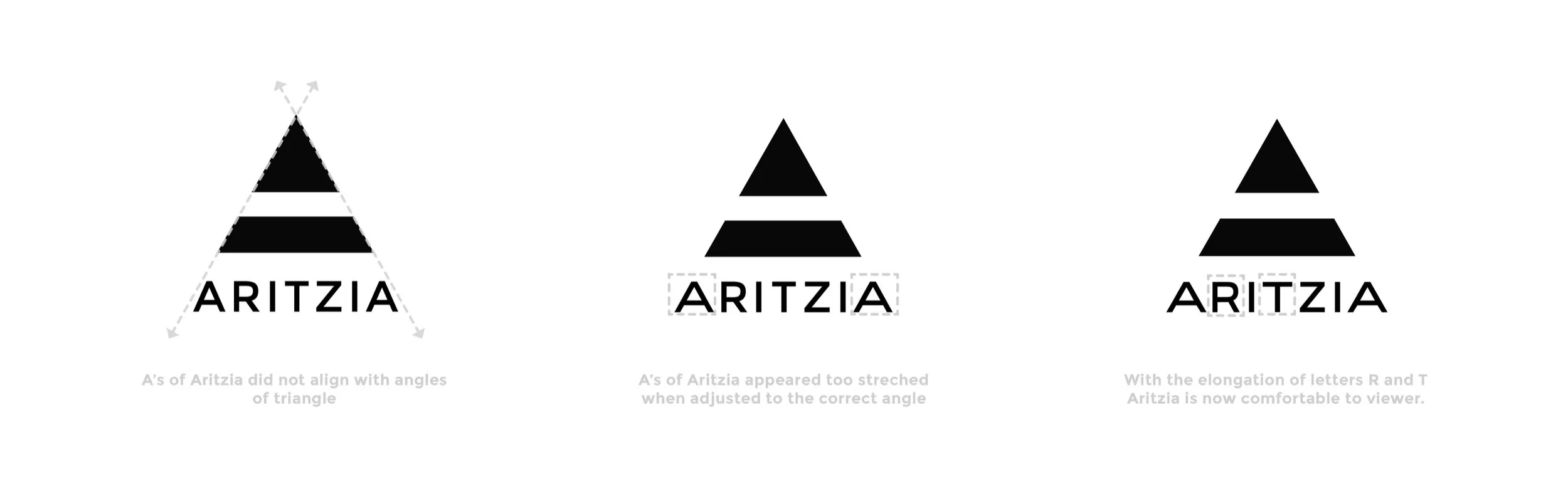
Brandmark Concept
Aritzia’s blend of opposite clothing styles inspired the concept of using negative space inside the letter “A” for their brandmark.
Color Palette and Typography
The feminine light pink tones contrasts well with black, white and earthy marble textures. Montserrat is used for Aritzia’s brandmark and for body copy elements. The typeface gives off a bold, edgy, fashionable vibe when used in all caps, however, it can also be soft, round and easily read when used as body copy. Faith and glory is used for headliners and important typographic accents. This typeface has a subtle alternate version for each letter, which makes the handwritten style appear more authentic. Unlike montserrat, faith and glory is expressive, romantic and delicate.


